The 12 Graphic Design Principles Explained
Posted by Clash Graphics on 14th Oct 2022
Avoid taking longer to produce the quality of graphics that will enable you to impress and demand the pay you desire. Knowing how the 12 principles of graphic design work together to create an image or convey a message will help you improve your work and give it meaning.
clashgraphics.com gathered the following information about graphic design principles and explained what they mean.
What are the Principles of Graphic Design?
Graphic design is a discipline of creative activities that projects visual signals intended to convey messages to specific demographics with clear and predetermined objectives. To help you achieve the ideal layout and composition, there are twelve succinct and recognized principles of graphic design, including:
- Contrast
- Balance
- Emphasis
- Proportion
- Hierarchy
- Repetition
- Rhythm
- Pattern
- White Space
- Movement
- Variety
- Unity
These principles work together in creating visually appealing and functional designs that make sense and convey information to viewers. Consider the following fundamentals, definitions and applications of each principle:
Principle #1 - Contrast
Contrast occurs when two or more elements in a composition differ. In design, use contrast to generate impact, highlight significance, create exciting graphics, and generate visual interest and dynamics.
Principle #2 - Balance

Balance in graphic design is offsetting how the weight of components balance or interact with each other on either side of a design to create satisfaction, completion, and cohesion. To accomplish visual balance, your composition will ideally balance diagonally, horizontally, vertically, or foreground versus background.
Principle #3 - Emphasis
The role of emphasis in graphic design is straightforward. It means having a focal point for your artwork. In the image, it can be any object or text area you see as the most crucial part of the message.
Principle #4 - Proportion
Proportion is the relationship between one design component and another on the whole design. It is a comparison or contrast of sizes, shapes, and quantities.
Principle #5 - Hierarchy
Hierarchy in graphic design uses several fundamental principles, including size, color, contrast, alignment, repetition, and brightness, to emphasize specific design characteristics. It controls those factors to show their importance or gravity within the design as a whole.
Principle #6 - Repetition
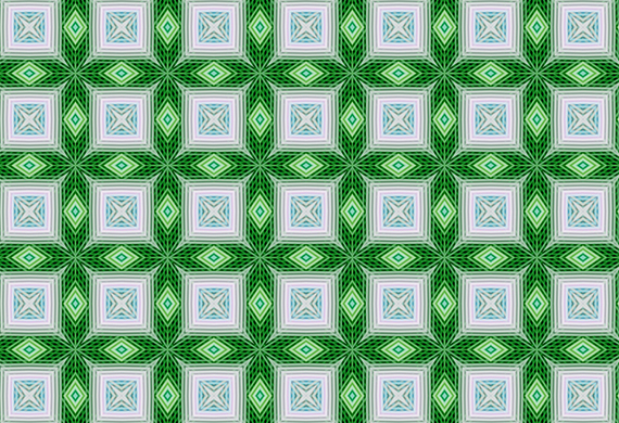
Repetition uses the same element over and over again. Repetition is an outstanding way to add texture to your design. Not only does it create an element of unity, but repetition can also help create texture and bring your project to life.
Principle #7 - Rhythm
Rhythm uses repeating elements in graphic design. Repeating elements, like shapes, lines, or colors, attract the observer's eye from one section of the piece to another in a cadenced way. Rhythm can simultaneously create a sense of order and a sense of movement.
Principle #8 - Pattern
Pattern is the repetition of multiple design elements. While repetition focuses on a single component, pattern represents multiple elements repeated throughout your design.
Principle #9 - White Space

White space also referred to as “negative space,” is empty space around and between your content and other functional elements of a design. The fundamental role of white space is to allow your design to breathe (or give viewers a rest) by reducing the amount of text and functional elements they must see and analyze at once.
Principle #10 - Movement
You can use movement to guide a viewer's eye in, through, and out of a composition. Movement is the path a viewer's eye takes through a design and reveals the intended message or objective. In an image, the kinds of lines, shapes, and forms you use can significantly affect this movement.
Principle #11 - Variety
Variety in design creates visual interest with varied shapes, colors, lines, and movement that strives to keep your viewers engaged with or interested in your design.
Principle #12 - Unity

Unity is appropriately the last principle, and it pulls all the other elements of your design together. Your design should be deliberate and focused on its intended message, with each element of your piece belonging there and supporting its overall idea or concept, rather than standing out in isolation or failing to fit with the rest of the design’s elements.
Why Use Graphic Design Principles?
Graphic design principles are the most crucial components of any design process. Without these principles, it would be challenging for the viewers to understand the messaging the designer is trying to communicate. Design fundamentally differs from art, in that design must have a purpose while art can be random.
Graphic Design Principles
In this article, you discovered definitions and applications for the 12 graphic design principles you must utilize to produce compelling and effective design work.
Deepening your comprehension of graphic design principles will help you meet or exceed your client’s expectations for superb and well-conceived graphic designs.
Skip wasting your time and not knowing the principles that ensure your designs are well done, recognized, and valued.
Sources:
pavilion.dinfos.edu/Article/Article/2705890/graphic-design-fundamentals-layout-composition/
extensionpublications.unl.edu/assets/html/g2031/build/g2031.htm
rasmussen.edu/degrees/design/blog/what-is-graphic-design/
Clash Graphics Print Shop Atlanta Flyer Printing
2233 Peachtree Rd NE Ste 202 Atlanta, GA 30309
(678) 235-3464


