Mastering Brand Typography and Fonts
Posted by Clash Printing Atlanta on 22nd May 2024
Selecting the ideal brand typography is about more than good looks; it’s a key player in how your customers see and connect with your brand. Through proper font choices, a brand can tell its story, convey its values, and leave a lasting impression. This piece dives into the various font styles, demonstrating how to apply them to your brand’s narrative and offering strategies for consistent, effective use.
Key Takeaways
- Brand typography is essential for conveying a brand’s unique identity and personality, affecting brand recognition, and establishing a visual symphony that engages consumers.
- Understanding different font categories (serif, sans serif, script, display / decorative) and selecting the suitable typeface is crucial for matching a brand’s personality and message, ensuring brand fonts resonate with target audiences.
- Consistency, readability, and a well-established typographic hierarchy are vital in typography to maintain user engagement and enhance brand recognition across various platforms and mediums.
The Power of Brand Typography
Typography is a visual component of a brand’s style guide, a tool that paints the brand’s personality with the brush of written language. Its power lies in its ability to express a brand’s unique identity and personality across various media channels, from web pages and advertisements to product packaging. Through techniques like font selection and styling, typography transforms the brand message into a visual symphony, sparking consumer interest and interaction.
But that’s not all. The consistent use of the same fonts establishes brand recognition, creating a sense of reliability. Think about it: when you see a particular sans-serif font, don’t you instantly think of a brand associated with modernity, simplicity, and innovation? Or, when you see a serif font, don’t you immediately associate it with elegance, tradition, and trust? That’s the power of brand typography – it makes brands memorable.
Understanding Different Font Styles
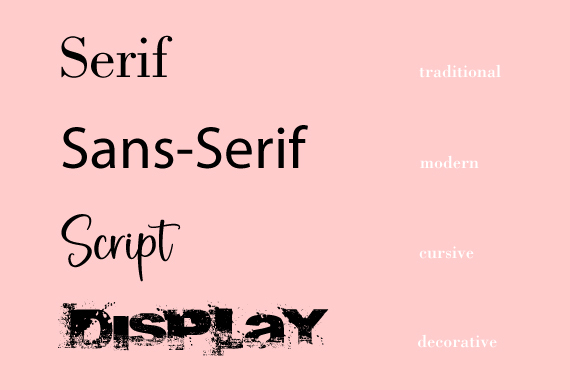
Consider standard graphic design principles when selecting fonts for your brand's typography design. Before we delve into the art of choosing the right fonts, let’s understand the different font styles that define the landscape of typography. There are four primary categories:
- Serif
- Sans Serif
- Script
- Display / Decorative
Each has its distinctive characteristics and emotional appeals. With these styles, the typographic universe expands into sub-classifications like slab serif, Monotype, humanist sans-serifs, and more.
Serif Fonts
Serif fonts, with their ‘hooks’ or ‘little feet’ at the ends of letters, exude elegance, trustworthiness, and a sense of establishment. They’re like the classic black dress in a wardrobe: timeless and trustworthy. That’s why traditional brands such as law firms, wineries, or newspaper companies often choose serif fonts. Their design aids reading flow in long printed texts, reducing eye strain. Baskerville, Times New Roman, and Garamond are all examples of well-known serif typefaces. These typefaces are widely used in print and digital media.
But what if you’re a modern, forward-thinking brand that wants to break tradition? Well, that’s where sans-serif fonts come in.
Sans Serif Fonts
Sans serif fonts, also known as sans serif typeface, are the modern rebels in the typography world. With clean lines and an absence of decorative flourishes, they shout simplicity and legibility. Their straightforwardness and clean aesthetic make them a favorite in contemporary design. They’re like the sleek, minimalistic furniture of a modern loft – bold, clear, and uncomplicated. Examples like Helvetica, Arial, and Futura have set the stage for the widespread use of sans serif fonts in digital media. With the availability of free fonts, designers have even more options to choose from [2.2_5].
But what if you fancy a bit of elegance and creativity in your fonts? Enter script fonts and display fonts.
Script Fonts
Script fonts are the artists in the world of typography. With their handwriting-like calligraphy, they bring a touch of elegance and a personal feel to your designs. They’re like handwritten love letters in a world of emails—personal, beautiful, and full of character. Brands aiming to portray an image of elegance or creativity often choose script fonts.
However, their beauty comes at a cost. Script fonts are often avoided in body text due to readability concerns. However, their aesthetic appeal makes them perfect for use where readability is not the primary concern, such as logos or headlines.
Display / Decorative Fonts
Last but not least, let’s talk about the wild cards of typography—decorative fonts. These fonts are all about creativity and originality, helping brands connect emotionally with their audience. They’re like unique accessories that add a touch of personal style to an outfit. Decorative fonts are great for specific branding applications, such as logos, where their unique characteristics can shine. Their adaptability and distinctiveness make them an excellent tool for expressing a brand’s individuality.
Now that we’ve explored the different font styles let’s choose the ones that best represent your brand’s personality.
Creating Your Brand's Typeface Personality
Your brand’s personality is like its soul. It’s what sets your brand apart and resonates with your audience. Therefore, it’s crucial to establish your brand personality, as it directs the choice of typography and influences the overall visual identity of the brand.
Say you’re a no-nonsense, forward-thinking brand. You’d probably opt for sans-serif fonts that reflect your straightforward vibe. Or, if you’re a friendly, approachable brand, you might go for rounded letter shapes. The key is to choose a good brand font that echoes your brand’s personality, creating a cohesive and resonant brand identity.
But it’s not just about the aesthetics; your font choices should also consider flexibility and timelessness, ensuring they can be scaled to different sizes and mediums and remain visually appealing across various platforms, from printed materials to digital content.
Choosing the Right Fonts for Your Brand
Choosing the right fonts for your brand involves more than just picking the ones you like. It’s about understanding your brand’s personality, analyzing competitors’ typography, and ensuring readability and consistency across various platforms.
It’s like choosing the right ingredients for a dish – each one should complement the other, and together, they should create a delightful experience.
Analyzing Competitors' Typography
In the world of branding, understanding your competitors is as important as understanding yourself. Analyzing your competitors’ typography can reveal their strengths and weaknesses, contributing to a more informed design strategy. Studying their visual design, including typography, helps you understand effective ways to communicate your own brand message.
Moreover, assessing your competitors’ typography helps your brand stand out in the market. By identifying usability issues in their user interfaces, you can enhance your own typographic readability and the overall user experience.
Selecting Fonts that Reflect Your Brand Message
Your brand’s message is its voice, and your typography is the tone in which that voice speaks. Therefore, it is critical to select fonts that reflect your brand message.
For instance, a brand centered around innovation and technology might use Monospace fonts, underscoring its focus on precision and technicality. Similarly, a brand aiming to portray an image of elegance might opt for elegant script fonts, while a brand aiming for a more modern and minimalistic vibe might go for sans serif fonts. The proper typeface selection evokes specific feelings and associations that resonate with your brand’s intended message.
Ensuring Readability and Consistency
Beyond choosing the right fonts, ensuring readability and consistency in your typography is crucial. Imagine reading a book with a different font on every page – confusing, right? That’s why selecting simple and easy-to-read fonts is crucial for maintaining user engagement, especially in larger blocks of text.
Consistency, on the other hand, enhances visual hierarchy and brand recognition. Whether it’s maintaining consistent sizing in headers and sub-headers or using the same font type across all platforms, consistency in typography is key. But remember, readability and consistency should not come at the cost of creativity. Your typography should be a balance of all three.
The Art of Mixing and Matching Fonts
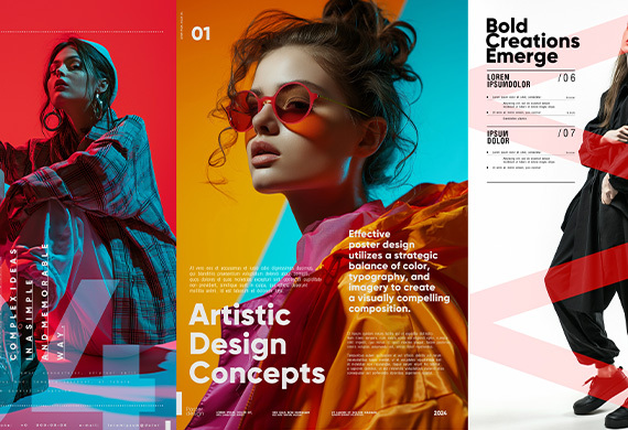
Typography is not just about choosing the right fonts but also how you use them together. The art of mixing and matching fonts can add depth and variety to your typography, enhancing your brand’s visual communication. The key to effective font mixing is attention to the following:
- Mood
- Contrast
- X-heights
- Kerning
- Character shapes
Combining fonts that are too similar can lead to poor hierarchy and visual confusion, while using different weights from the same font family can create a subtle yet effective contrast.
Experimentation and creativity play significant roles in discovering intriguing font combinations beyond conventional pairings, like matching ‘introverted’ with ‘extroverted’ typefaces.
Establishing a Typographic Hierarchy
Just as a well-structured article guides readers through its content, a well-planned typographic hierarchy guides the viewer’s focus, indicating levels of importance. This hierarchy is achieved through the following:
- size
- weight
- color
- contrast
- case
- position
- style
- alignment of typefaces
along with strategic use of spacing, guides the viewer’s attention.
Contrast plays a crucial role in establishing a visual hierarchy, as it creates visual interest and distinguishes different levels of text within your brand’s typography. Whether it’s using varying font sizes for headings, subheadings, and body text or using colors to differentiate sections of text, a well-established typographic hierarchy can significantly enhance the readability and visual appeal of your text.
Customizing Fonts and Treatments
Customizing fonts and treatments is like adding seasoning to a dish – it enhances the flavor, making it more interesting and appealing. Companies like Southwest Airlines, the Financial Times, and Raiffeisen Bank have leveraged custom typefaces to align typography with their brand identity and values.
From freeform serif fonts that break traditional typography rules to the use of unique type families for expressing inclusivity and celebration, strategic custom typography can enhance your brand’s visual identity and create a signature brand identity typography style that resonates with your audience.
Creating a Comprehensive Brand Style Guide
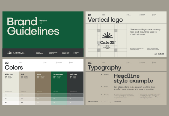
Once you’ve chosen your fonts, established your typographic hierarchy, and customized your treatments, the next step is to document all these decisions in a comprehensive brand style guide. This guide ensures that all content creation is consistent with the brand’s identity and serves as a reference for designers, writers, and developers.
Whether you’re a global company with teams spread worldwide or a small startup, having a style guide accessible online ensures all teams can refer to it, regardless of location. This is particularly crucial when undergoing a brand redesign, as a new style guide ensures everyone is on the same page (quite literally!).
Case Studies: Successful Brand Typography Examples
Nothing elucidates the power of brand typography better than real-life examples. Brands like Netflix, Airbnb, Apple, and Coca-Cola have harnessed the power of custom fonts to create strong visual identities.
For example:
- Netflix uses the typeface Gotham to convey a modern and sleek image.
- Airbnb uses the typeface Circular to support its message of hospitality and warmth in unique places.
- Apple uses the typeface San Francisco to create a clean and minimalist aesthetic.
- Coca-Cola uses the typeface Spencerian Script to evoke a sense of tradition and nostalgia.
Partnerships like Monotype with D8 for Pride Amsterdam and Monotype with Lippincott for NYC Pride resulted in unique type families and identities that express inclusivity and celebration. M&M introduced the ‘All Together’ typeface, reflecting its brand's support in playfulness, inclusivity, and belonging values.
In the realm of timeless fonts, Baskerville and Caslon convey tradition and elegance, while Bauhaus expresses a trendsetting, retro vibe. Other brands, like Evian, Bodoni, and the University of Michigan, use simple typefaces, sophisticated identities, and educational typography to project their unique brand messages.
Brand Typography Summary
Typography is a powerful tool in branding that shapes a brand's visual identity, setting it apart from the crowd. It’s much more than just selecting the right fonts; it’s about understanding font styles, aligning them with your brand’s personality, analyzing your competitors’ typography, ensuring readability and consistency, mixing and matching fonts effectively, establishing a typographic hierarchy, and customizing fonts and treatments. By mastering these elements, you can create a unique brand personality that resonates with your audience and stands out in the market.
Typography Frequently Asked Questions
These are the more common questions Clash Graphics customers ask about typography:
What is the importance of typography in branding?
Typography is essential in branding because it communicates a brand's identity and personality, leading to better consumer engagement and brand recognition.
How do I choose the right fonts for my brand?
To choose the right fonts for your brand, consider your brand's personality, analyze competitors' typography, and prioritize readability and consistency across platforms.
What is typographic hierarchy?
Typographic hierarchy is a method of organizing text in design to emphasize levels of importance and direct the reader's attention. It helps guide the viewer's focus, especially in branding and design systems.
How can I customize fonts for my brand?
To customize fonts for your brand, add unique treatments and modifications to align them with your brand identity and values.
What is a brand style guide?
A brand style guide is a document that sets out design standards for a brand, ensuring consistency in all content creation. It helps maintain the brand's identity and visual cohesion.
(678) 235-3464

